Update Your Website with EverWeb’s Updated Image Slider
July 30th, 2015EverWeb’s Image Slider has gained new features in version 1.8 with the addition of slideshow Captions, a Transparency option for your Slideshow background and the ability to add URL links to slides. So, why not give an existing slideshow an update or create a new slideshow from scratch incorporating some of these new features?
If you want to start a new slideshow, just drag and drop the ‘Image Slider’ widget from the ‘Widgets Inspector’ on to your page. Place and size the Image Slider placeholder as desired.
With the placeholder still selected, go to the ‘Widget Settings’ in the ‘Inspector Window’. Here is where you add, arrange and delete slide images. Drag and drop images from anywhere on your computer into the Assets List. To reorder the files in the list just drag and drop the image filename to where you want it. You can use Shift+click to select contiguous files or Cmd+click to select multiple files that are not next to each other in the Assets list.
If you have added an image that you do not want, highlight it’s filename in the Assets List and press the backspace key to remove it. Although the filename disappears, it can be always be added back using the ‘Choose…’ button.
You can also add images using the ‘Choose…’ button. When using ‘Choose…’ you will see a list of the image files associated with your EverWeb Project. If the image file you want is not listed, click on ‘Choose…’ at the top of the list and navigate to where the image files you want are located. In EverWeb 1.8 you can now select contiguous files by using Shift+click to select contiguous files or Cmd+click to select multiple files that are not next to each other
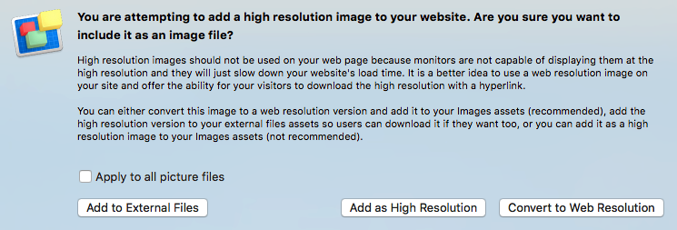
When selecting Images for your slideshow, make sure that they are optimised for use on the Web. Large image files slow the loading of your web page and affect the performance of your slideshow. EverWeb detects large files on import and offers you a choice as to whether you want to use the original file or a web optimised version.
It’s also important to use images of the same size, quality and orientation in your slideshow e.g. your images should either be all portrait or all landscape and not a mix of both. Images should be also of the same dimension and quality in your slideshow.
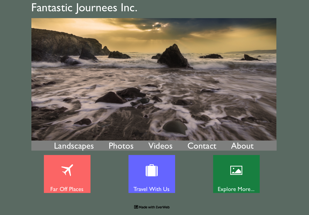
In the example below we have created a web page for a fictional company, ‘Fantastic Journees Inc’, with the company name in the top left hand corner of the page. Below the company name is the Image Slider followed by a Navigation Menu with a rectangular colored shape behind it providing a background contrast.
We can start to update the Image Slider by making it ‘Full Width’. Select the Image Slider then go to the Metrics Inspector and click on the ‘Full Width’ button. In addition make the Image Slider ‘Fixed Position’ at the same time. Lastly, select Arrange-> Always On Top from the menu.
Next select the company name and make this also ‘Full Width’, ‘Fixed Position’ and ‘Always On Top’. If the find that the text is right up against the left hand margin of the page, use the Text Inspector to add a margin in using ‘Insert Margin’.
Repeat the above steps for the Navigation Menu and it’s background coloured rectangle. Rearrange any objects that may have moved position on page due to the use of ‘Fixed Position’.
With the basic page layout updated, let’s update the Image Slider. In this example we are going to add a caption to each slide.
To add a caption to a slide, select the image file name in the Assets List. Next enter the text you want for your caption in the ‘Caption’ box. To change the font size and style, click on the Fonts button and use the Fonts Panel to select the options that you want to use.
If you want to add a URL link, enter it in the ‘URL’ box. If your visitor clicks on the image they will be taken to the page you have linked. When adding links, make sure you use the full descriptor e.g. ‘http://www.fantasticjournees.com/homepage.html‘. Remember to test the link using ‘Preview’ before going live with your changes.
Note that if you enter a link in the ‘URL’ box, it will override ‘Click to enlarge image’ if you have ticked it in the Behaviour section.
If you want to add a background colour to your caption select the ‘Background’ color swatch in the ‘Caption’ section at the bottom of the Widget Settings. Use ‘Background Opacity’ to change the background transparency. If you do not want a background color at all set the value to zero.
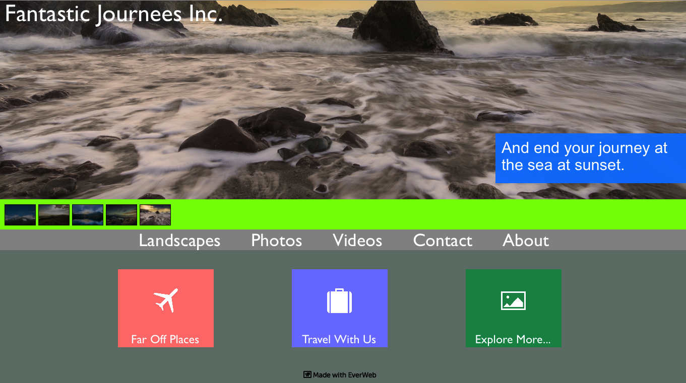
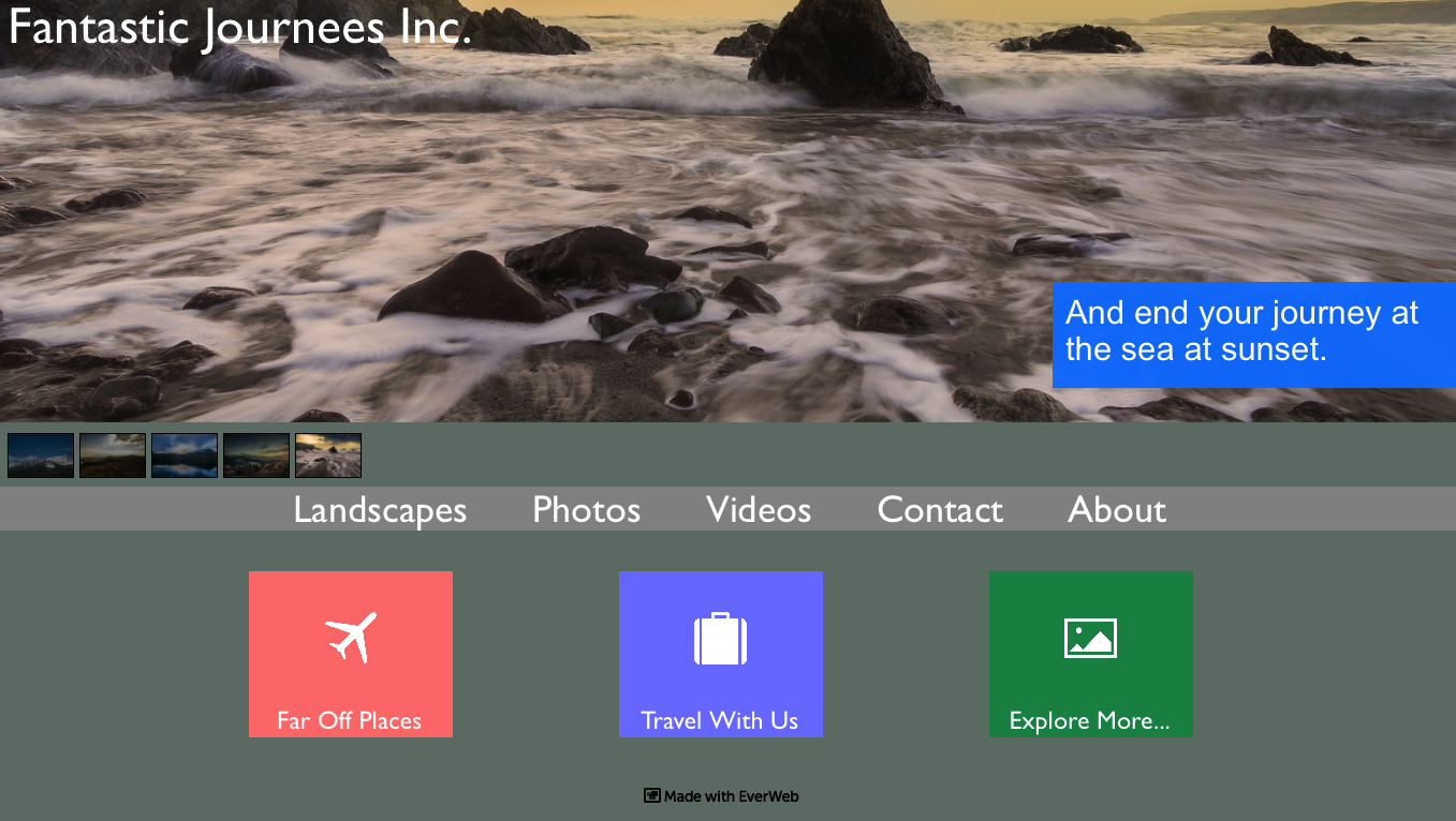
You can place the caption where you want within the Image Slider using a combination of ‘Caption Left’ and ‘Caption Top’. These options operate like x and y co-ordinates when placing the caption. When you publish the page, the caption automatically scales and resizes as you change the size of the browser window as seen in the two screenshots below.
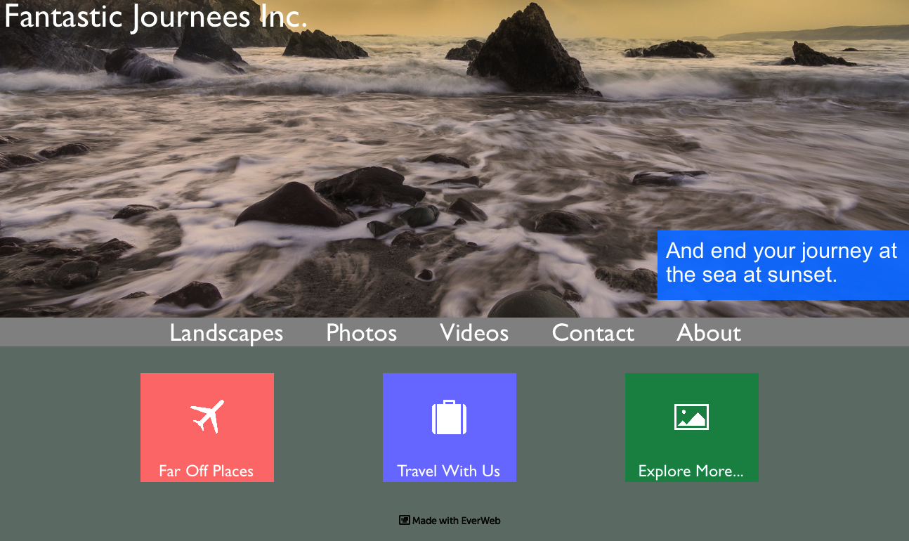
The Image Slider is full width and resizes as you adjust the browser size, as does the Navigation Menu.
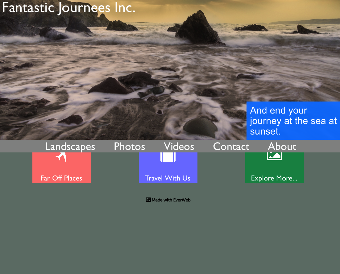
As the browser window shrinks you see that the caption automatically resizes. You can also see the results of the use of Fixed Position and always on top here as the items below the Navigation Menu scroll under the menu.
Use ‘Caption Width’ to define the height and width of the caption text and background box color if you have one.
When creating captions for all of your slide images, try to make the text about the same length for each slide so that the caption box remains a consistent same size from slide to slide when viewing the slideshow.
In addition to captions, you can now make the slideshow background transparent. This is useful when you use Thumbnails and want the slideshow to blend in with the page background color. See the two screenshots below.
And finally, don’t forget that there are some great Transition effects to play with such as Pulse and Flash. Try experimenting with these as they can really liven up a slideshow especially when used with vibrant background colours that you set using the ‘Background’ color swatch in the Appearance section.
The Image Slider update keeps your website slideshow fresh and up to date a new modern, dynamic look and feel. With a little experimenting of Image Slider’s new, and old, features, you will give your visitors a great slideshow experience!

