Getting Started with EverWeb’s NEW Map Fill for More Map Options Than Ever!
Thursday, July 25th, 2024
The new Shape Options Map Fill feature, introduced in EverWeb 4.2, gives you more options and control than ever before for any Google Maps that you may want displayed in your website. In addition to EverWeb‘s existing Google Maps widget, you now have map fill options available from the Shape Options tab.
Google Maps Widget or Shape Options Map Fill?
From EverWeb 4.2 onwards, you now have two ways of adding a map to your website: The Google Maps widget and the Shap Options tab’s Map Fill option. The Google Maps widget was introduced in EverWeb 1.0 and offers you a simple Roadmap view displayed in your website. Just enter an address in the Address field of the widget’s Widget Settings and you will see the resulting map in the Editor Window.
Now in EverWeb 4.2 you can now choose to fill a shape object with a map instead. Using the new Shape Options Map Fill gives you three different levels of map features.
If you only require a simple map with no extra features, you can use either the Google Maps widget or the Shape Options tab’s Simple Map (Deprecated) feature. They both use the same Roadmap feature. If your map requirements require more options and flexibility, you should choose either the Shape Options Map Fill Basic Map (Free) or Advanced Map option
Starting With the Shape Options Map Fill
To use EverWeb’s Map Fill feature, first
- Go to the page where you want to add the map, or create a new page, in your site
- Click on the Shape button in the Toolbar and select a shape. Note that when using the Map Fill option, whatever shape you have chosen here will be converted in to a rectangular shape in order to display the map.
- Click on the Shape Options tab in the Inspector Window
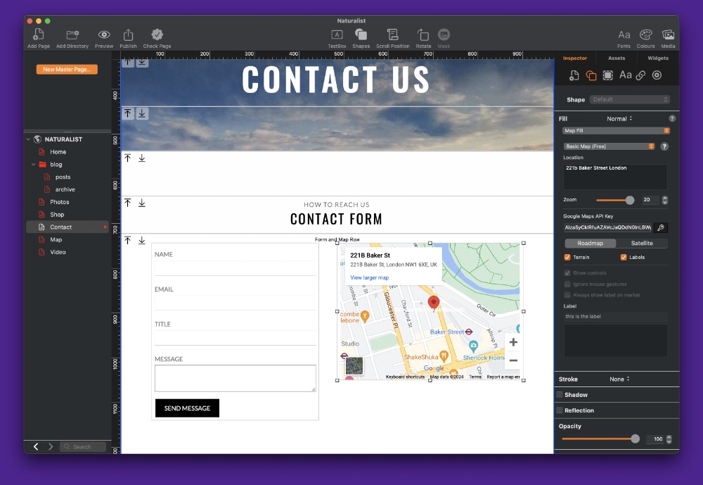
- In the Fill section, click on the dropdown menu and choose ‘Map’ from the menu.
- You now see a notice informing you that you will need to use a Google API Key in order to access the available map Basic Map (Free) and Advanced Map features.
- Choose to either ‘Get Google API Key…’ or ‘Got It’ if you already have an API Key, or want to set this up later. We will discuss getting a Google API Key later on in this blog post.
Map Fill Choices
When it comes to using EverWeb’s new Map Fill feature you have three different levels of map integration to choose from:
- Simple Map (Deprecated)
- Basic Map (Free)
- Advanced Map
The first level, Simple Map (Deprecated), offers the same Roadmap map display as found in EverWeb’s Google Maps widget. Just enter the address that you want in the Location field and the map will be displayed in the Editor Window. The one difference between using the Google Maps widget and the Shape Options feature is that the latter allows you to set a zoom level for the displayed map in the Editor Window.
The second Map Fill option is the Basic Map (Free) option. This option requires that you complete the Google Maps API Key field in order to use its features (see below). This map option allows you to select either a Roadmap view or a Satellite view. In Roadmap view, you can toggle Terrain and Labels on or off, whilst in Satellite view you have the option only to toggle Labels.
Google Maps Cloud Platform and API Keys
When you use the new Map Fill option in EverWeb 4.2 or higher, you will need to include an “API Key code” if you want to use the Basic (Free) or Advanced Map features.
Once you have generated the necessary Key you will then enter it in to the Map Fill ‘Google Maps API Key’ field.
Generating the Google Maps API Key is easy because when you select the Basic or Advanced Map option, EverWeb will display a dialog box with an option to ‘Get Google Maps API Key’.
When you click on this option, you will be taken in to Google Cloud Platform which will then step you through generating a Maps API Key that you can use in EverWeb.
In order to generate a Google Maps API Key, you will required to complete the following steps:
• Create a Google account if you do not have one already, then add Google Cloud Platform to your account.
• If you already have a Google account, you may be asked to log in. Once logged in you may be asked to add Google Cloud Platform to your account.
• You may also be asked to supply billing details to Google. If you are using the Basic (Free) option in EverWeb, you will not be billed. If you are using the Advanced Maps option, you will be charged by Google for using the Advanced Map features.
• You will need to create a Google Could Platform Project, if you have not already created one.
• You will need to make sure that you enable Google Maps Platform APIs and SDKs for your Google Cloud Platform project.
Once you have completed the steps required by Google to generate a Google Maps API Key, copy the API Key to the Clipboard and paste it in to the Google Maps API Key field in the Map Fill section in EverWeb.
Next Steps…
Now that you have added your Map Fill object to your page in conjunction with generating a Google Maps API Key, you can now explore Map Fill’s options as explained in our “EverWeb’s Shape Options Map Fill Feature Set Explained!” post.
if you have any comments on this post, please let us know in the Comments Section below!

